
Article by Julie Morris
Image via Google Gemini
How Musicians Create Visual Brands That Connect and Inspire
Aspiring musicians, especially beginner guitar and ukulele players around Newton and Groton, MA, often put their energy into chords and songs, then wonder why their posts, flyers, or profiles blend into the background. The core tension is simple: the music may be improving, but without visual branding for musicians, first impressions stay vague and potential listeners scroll past. Music marketing basics start with what people notice first, and that’s the importance of visual identity, the colors, photos, and overall vibe that signal who the artist is. A clear musician brand identity helps listeners recognize the music before they even press play.
What a Unified Visual Brand Really Means
A unified visual brand is the full picture people absorb before they hear a note. It blends photos, colors, fonts, outfits, and design choices into one recognizable identity, so your personality and genre feel clear. In practice, visual branding is the imagery and aesthetic that represents who you are as an artist.
This matters because most listeners decide fast whether to pause and pay attention. When your visuals tell the same story everywhere, you look more confident and easier to follow. Even small choices like a steady color palette can help, since consistent use of color can increase brand recognition by up to 80%.
Think of it like showing up to a first lesson with a clear goal. If your moody black-and-white photos match your indie ballads, people expect that feeling and stay. If your bright, playful flyers match your ukulele covers, your audience relaxes and leans in.
Visual Touchpoints Compared at a Glance
For beginner to intermediate musicians in Newton and Groton, the easiest way to build a visual brand is to pick a few touchpoints and make them match. The table below compares common places your look shows up, so you can choose what to standardize first and avoid starting from scratch every time you share your music.
| Option |
Benefit |
Best For |
| Album art design |
Sets the emotional tone fast |
Singles, EPs, streaming thumbnails |
| Social media visuals |
Reinforces recognition through repetition |
Posts, stories, lesson recaps, short clips |
| Merchandise branding |
Turns fans into walking reminders |
Stickers, tees, picks, tote bags |
| Live show aesthetics |
Makes the experience feel intentional |
Backdrop, lighting colors, stage outfits |
If you are short on time, start with the touchpoint you use weekly, usually social visuals, then align album art and stage choices to the same palette and type. Some business data suggests brand consistency can improve outcomes, and the practical win is simpler: fewer decisions, clearer signals. Choose one place to tighten up first, and your next move becomes obvious.
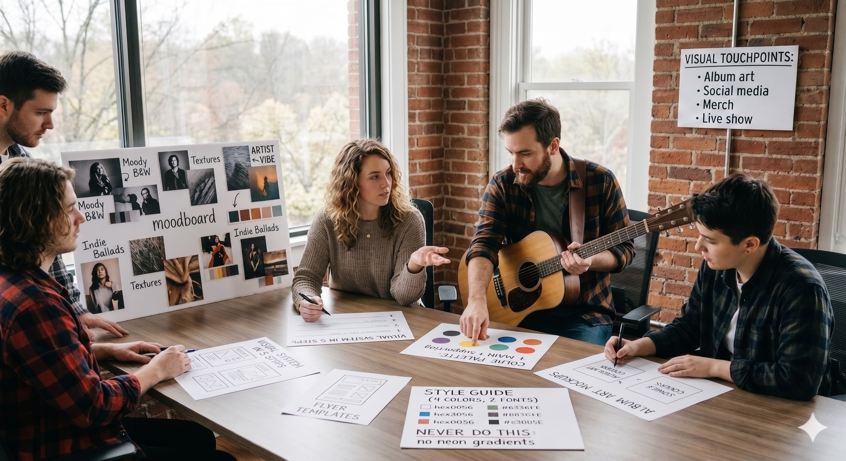
Build a Cohesive Visual System in 5 Steps (Moodboard to Templates)
A cohesive visual system makes your album art, posts, merch, and live-show look like they came from the same “musical world.” Here’s a simple, beginner-friendly way to build one you can actually stick with.
-
Create a moodboard with one clear vibe: Collect 15–25 images that match the feeling you want people to associate with your music (colors, textures, type styles, outfits, stage lighting, photo poses). A good mood board definition is basically “a set of visuals selected to define the emotional context,” so you’re not hunting for random “cool” ideas, you’re building a consistent emotional signal. Put your moodboard in one place (a notes doc or slide) so you can glance at it before you post anything.
-
Pick your “recognition anchors” (color first): Choose 1 main color, 1–2 supporting colors, and 1 neutral (black, white, cream, or gray). Keep them consistent across touchpoints, your gig flyer shouldn’t look like a different band than your Instagram or your lesson promo. Brand consistency matters because consistent color can increase brand recognition by 80 percent, and color is the easiest element to repeat even when your photos and venues change.
- Write a one-page style guide you can follow when you’re busy: Keep it simple: your 4 colors (with hex codes), 2 fonts (or “one font + one fallback”), photo rules (warm vs. cool, grainy vs. clean, close-ups vs. wide shots), and 5 “never do this” rules (like “no neon gradients,” “no more than 2 fonts,” “no tiny hard-to-read text”). Add a mini “voice” line too: 3 adjectives such as “bright, friendly, practice-focused.” This keeps your visuals aligned with your teaching and musician identity.
- Build 6 reusable templates for your main touchpoints: Make one template each for: social post, story, event flyer, cover concept mockup, lesson/promo graphic, and a merch design starter (logo or wordmark layout). Each template should already include your colors, type, spacing, and a placeholder photo area, so you only swap text and images. This is where your “Visual Touchpoints” priorities pay off: you’re designing once, then deploying everywhere.
-
Set up a lightweight graphic “generator” workflow: Create a small library of components you can mix and match: 10 backgrounds, 10 icons/shapes, 10 photo overlays, 10 text layouts. Use a basic design tool that supports saved styles and simple automation features (like brand kits, reusable blocks, or bulk versions), or an AI tool for generating graphics, so you can produce 5–10 on-brand assets in one sitting. The goal is speed without drifting, your rules make the decisions for you.
Visual Branding Questions Musicians Ask Most
Q: Do I need a professional designer to look “legit”?
A: No. A simple, consistent look beats a flashy one you cannot maintain. Pick two fonts, a small color set, and one photo style, then apply them everywhere. Upgrade later when you have steady gigs or releases.
Q: What if my musical style changes in six months?
A: Let your visuals evolve on purpose, not randomly. Keep one constant element such as a signature color or symbol, then refresh everything else in one pass. Think of your brand as your identity and promise, not just a cover art vibe.
Q: How do I know if my “brand” is more than a logo?
A: Your brand is everything from your logo, your core values, customer experience, so check if your captions, lesson promos, and stage photos feel like the same person. Write three words that describe how you want people to feel after hearing you.
Q: Can I use AI tools without looking generic?
A: Yes, if you give the tool constraints. Feed it your colors, a reference mood, and a repeatable layout, then edit the final result to match your tone.
Q: Should my teaching and performance visuals match?
A: They should relate, even if they are not identical. Use a shared palette and typography so your “teacher you” and “artist you” feel connected.
Make Your Music Recognizable With One Consistent Visual Promise
It’s easy to feel pulled between sounding like yourself and looking “professional,” especially when your style is still evolving. The answer isn’t perfection, it’s choosing a simple visual promise that supports your musical message and letting visual storytelling in music do the steady work of connection. When that promise stays consistent, the power of visual branding shows up as trust: audiences recognize the vibe faster, remember the songs longer, and feel invited into your world, which builds real artist branding motivation. Your visuals don’t replace your sound, they help people find it. Update one platform header or one merch item to match that promise this week. That small act of consistency creates a branding impact on the audience that supports confidence, resilience, and connection over time.